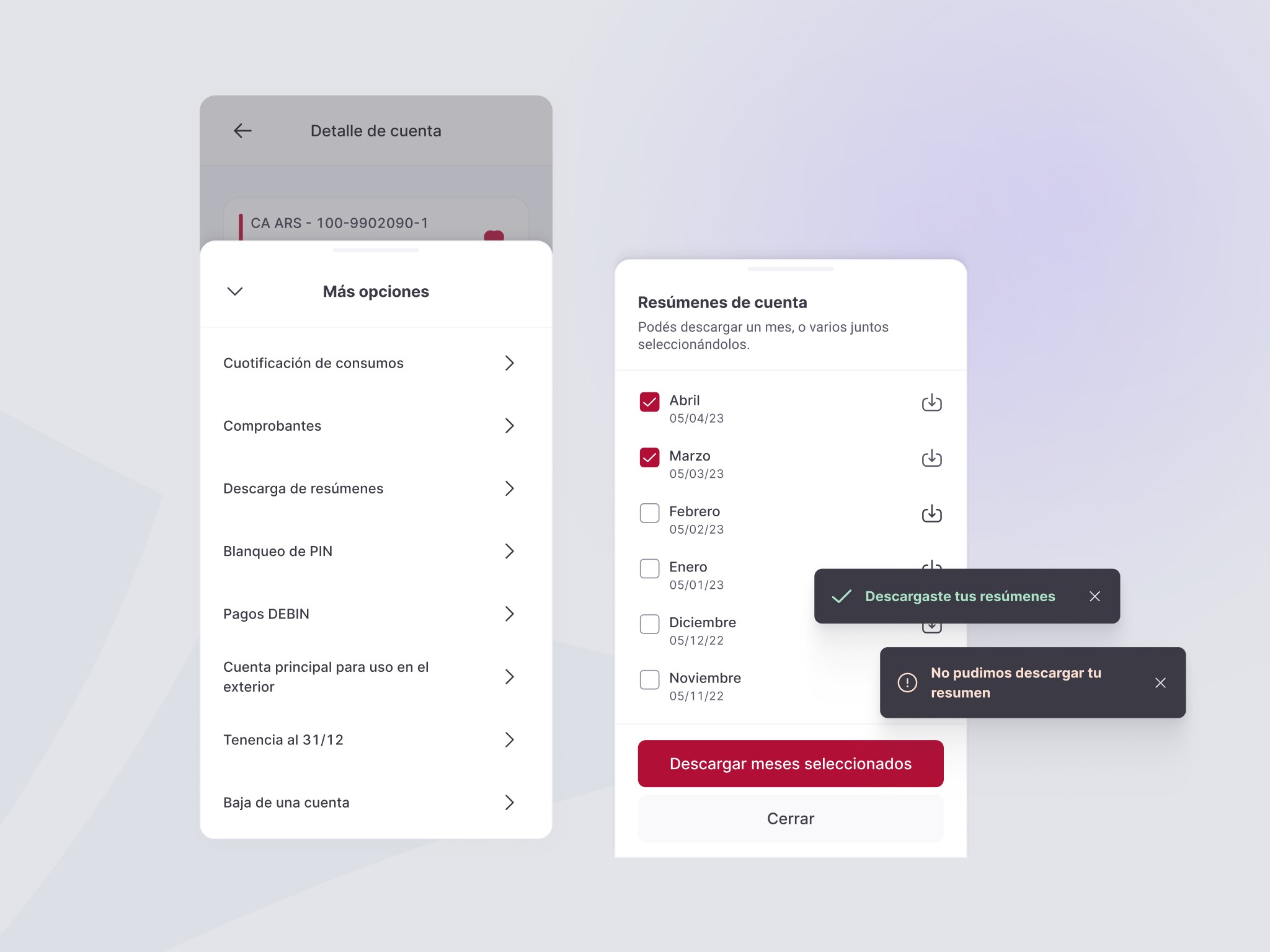
Statements, finally easy to download
Access and download monthly statements in just a few steps.
A redesigned core banking experience, unified across web and mobile.
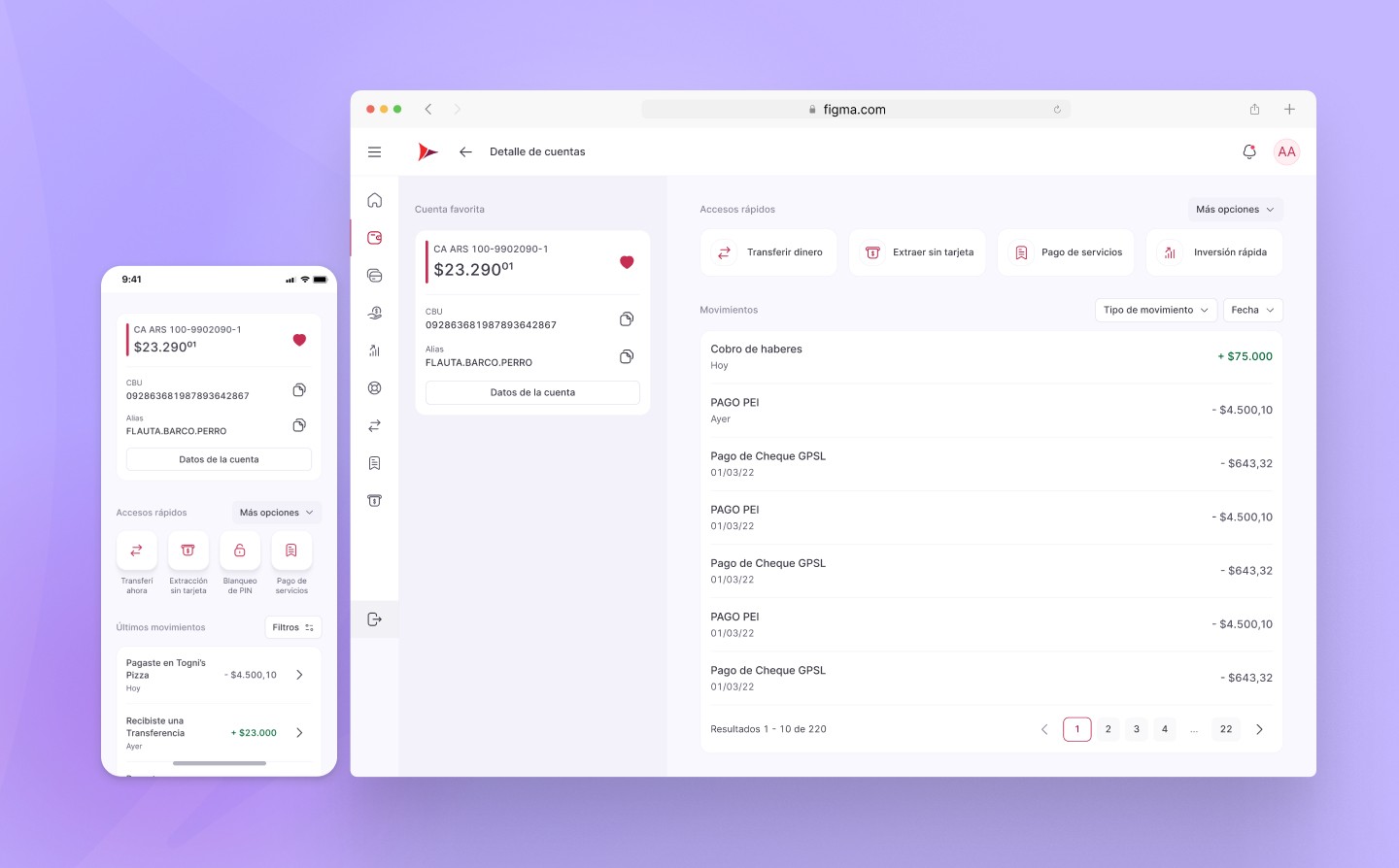
Banco Supervielle is one of Argentina's largest private banks, part of the NYSE-listed Grupo Supervielle, its digital banking channels serve over 1.4 million active users.
In 2022, the bank began rolling out a new design system across its entire online banking platform, to unify an experience that had grown inconsistent channel by channel. Accounts surfaced as the clearest case: one of the most-used sections in the product, but the one lacking features other channels already had, generating friction anywhere it touched the app experience.
I owned Accounts end to end, research, UX writing, and design, working directly with the product owner and business team to align on goals, and with engineering to understand technical constraints before scoping the solution.
I ran the audit myself: reviewing analytics and Hotjar recordings, running a benchmark analysis against other banks, then turning those findings into the information architecture and flows. High-fidelity screens went through validation with the design system and content teams before I scripted and ran the usability testing that closed the loop.
The problem
I was briefed to bring Accounts in line with the new design language, a visual refresh. My audit found something bigger: a section working against its own users, with confusing navigation and unclear hierarchy, common tasks that took too long and were hard to find, dense technical text that intimidated non-expert users, and inconsistencies causing real errors, not just friction, but lost data mid-task.
That's what turned the brief into a full rebuild of the section's information architecture, not a coat of paint.
The solution
Three principles guided the redesign: a consistent design language across channels, functionality made discoverable instead of buried in menus, and a fast path to whatever the user came to do. A few examples of what changed:
Access and download monthly statements in just a few steps.
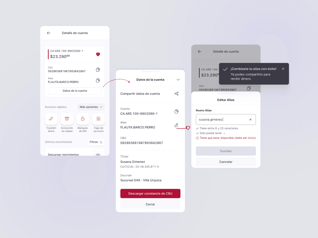
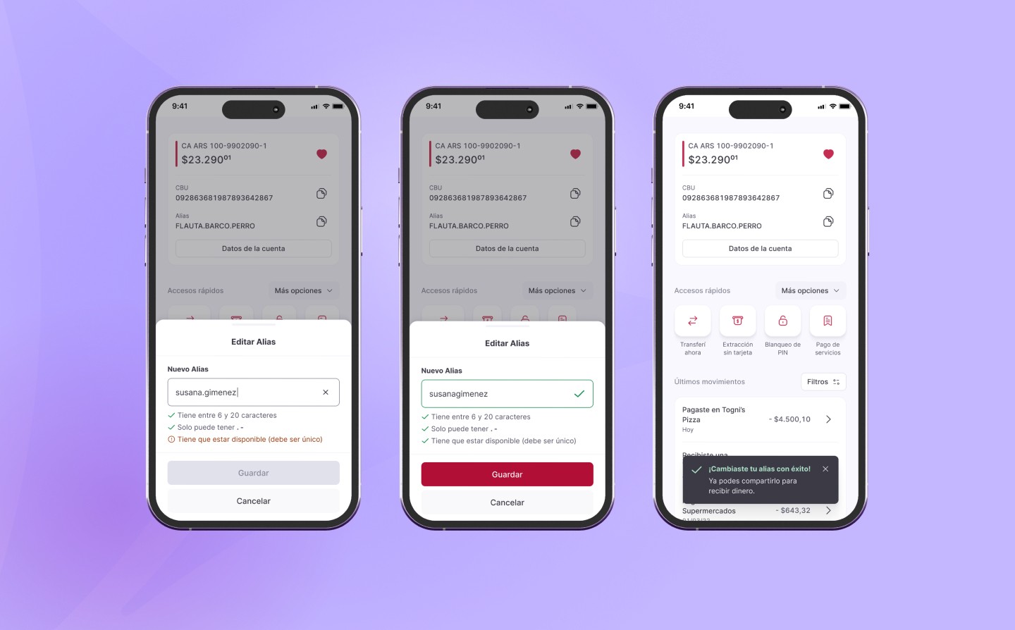
Update your alias through a clear, step-by-step flow, done in seconds.
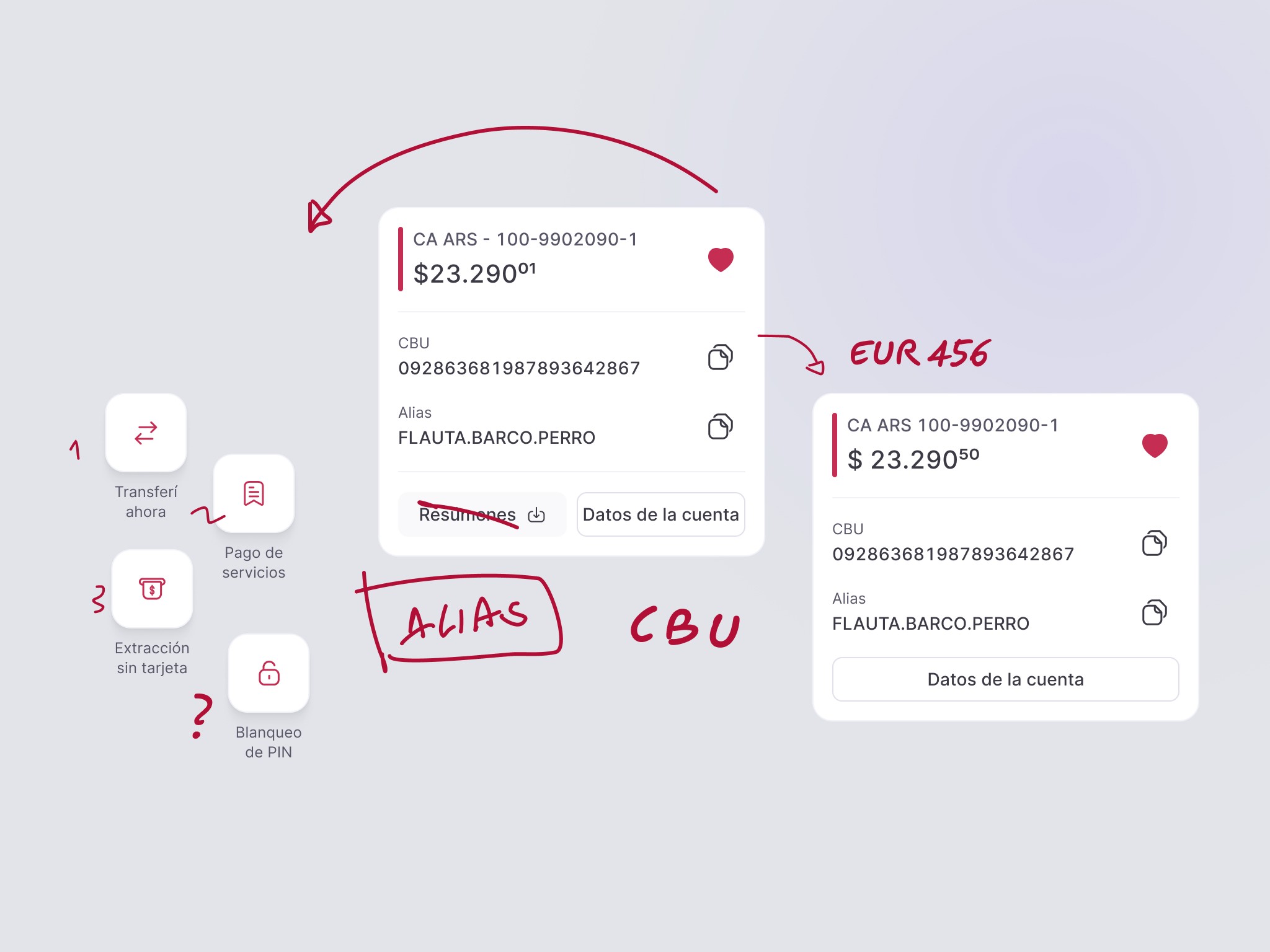
Copy your CBU, alias, and account details in one tap.
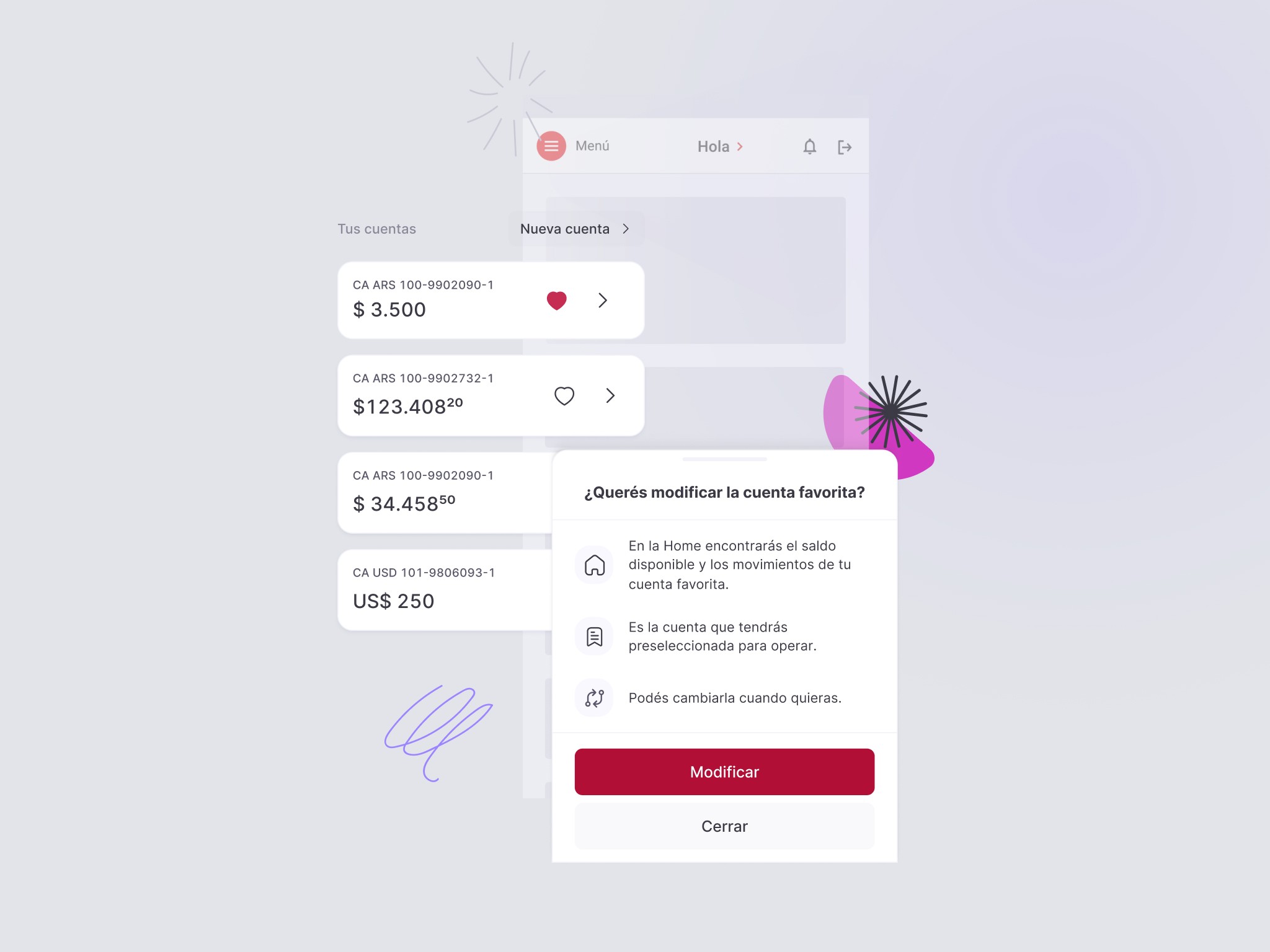
Set a default account and find it exactly where you need it.
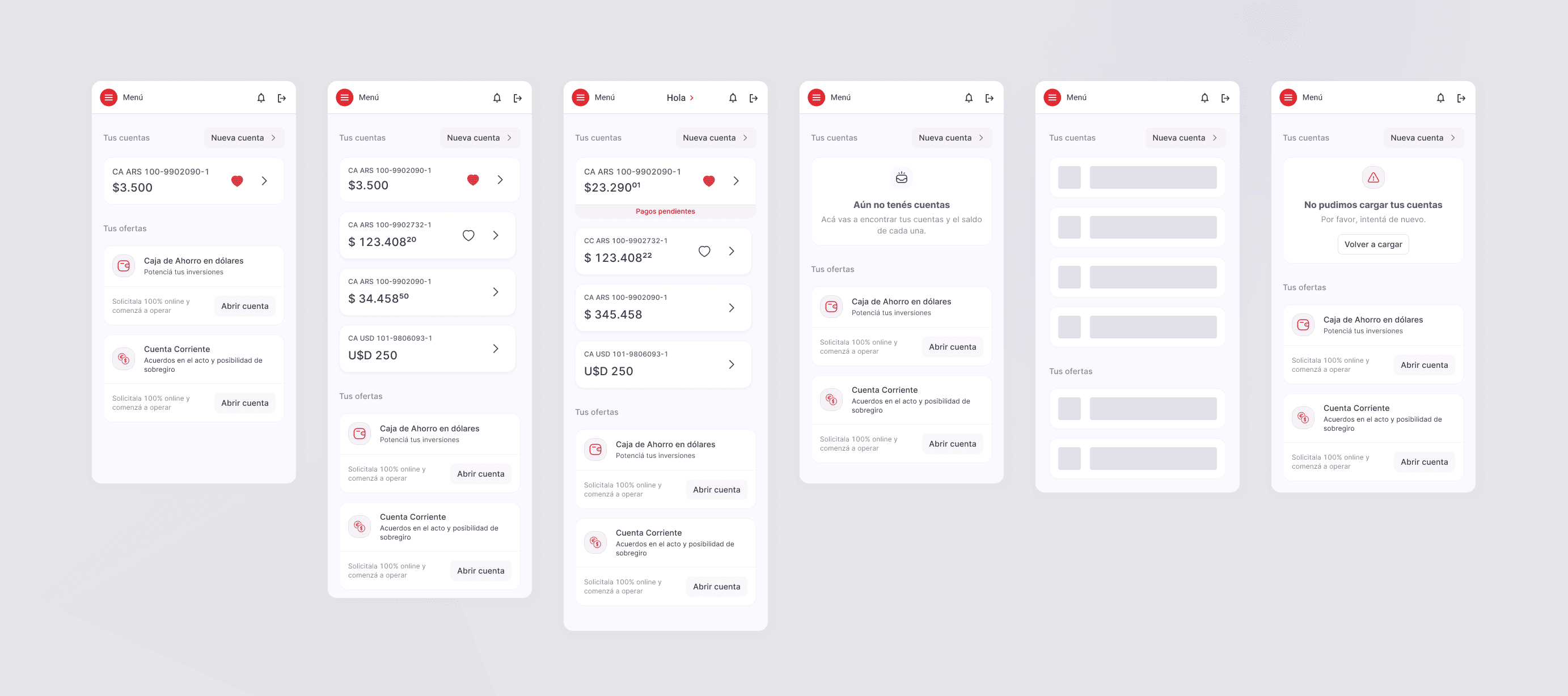
Empty states, errors, loading, every edge case was designed with the same care as the happy path.